Why Dashboards Don't Work for AI in Heavy Industry
We built a beautiful dashboard for industrial AI. Operators loved the data. Then we threw it away and built a chat interface instead. Here's what four prototypes taught us about where AI actually belongs in plant operations.
We built a dashboard. It was good. Clean layout, realistic data, DCS-style process diagrams, 12 units across 3 plants with color-coded health scores. An engineer could drill from fleet overview down to a single gas turbine's bearing vibration trend in two clicks.
We showed it to operators. They engaged with it. They corrected our tag naming conventions. They questioned our health score formula. They told us about their own escalation paths.
Then we threw it away and built a chat interface instead.
This is the story of why — and what it taught me about where AI actually belongs in industrial operations.
The Dashboard Assumption
Dashboards make a fundamental assumption: you know what to look at.
A fleet overview with 12 unit cards assumes the operator's first job is scanning for anomalies. A unit detail page with four data panels assumes they need operational context, maintenance history, commercial position, and fleet intelligence — in that order, at that level of detail, every time.
This assumption works well enough for monitoring. It falls apart for decision-making.
Here's why. When an operator at a combined-cycle gas turbine plant asks "should I be worried about GT-1?" — the answer requires pulling from systems that were never designed to talk to each other. The vibration trend comes from the condition monitoring system. The maintenance history comes from the CMMS. The financial impact depends on today's electricity price from the grid operator, the gas price from the commodity market, and the terms of a long-term service agreement sitting in a contract management system somewhere. The weather forecast affects load dispatch. The team roster determines whether the right people are even available. Compliance deadlines constrain the outage window.
No dashboard layout can anticipate which combination of those systems matters for this question, on this day, for this unit.
That's the problem we kept running into. We'd design a beautiful four-panel view — Operational Context, Maintenance History, Commercial Position, Fleet Intelligence — and in interviews, engineers would immediately ask about something from a fifth system we hadn't included. Or they'd ignore two of the panels entirely because they weren't relevant to their current situation.
The dashboard was showing the right data. It was answering the wrong question.
What We Tried First
We went through four distinct interaction paradigms in about eight weeks. Each one tested a different hypothesis about how operators want to engage with cross-system intelligence.
Round 1: Landing pages. Static concept pages, each testing a different value proposition. Fleet prioritization with financial impact. Unified condition monitoring. Institutional knowledge capture. We showed these to operators across solar, wind, offshore, and thermal generation. The signal was clear: financial impact visibility and pattern recognition across fleets scored consistently high. Knowledge capture scored near-zero for renewables operators — the failure modes are too simple and too OEM-dependent.
What we learned: the problem is real and the value propositions land. But a landing page can't test whether the product actually works.
Round 2: Role-based entry points. Three personas — Maintenance Manager, Operations Manager, Fleet Executive — each routing to tailored views of the same underlying data. The hypothesis: different roles need different lenses on the same plant.
What we learned: operators didn't care about the persona routing. They cared about the specific question they had that morning. Role-based navigation is an organizational chart imposed on a workflow that doesn't follow org charts.
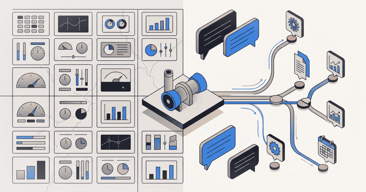
Round 3: Interactive dashboard with drill-down. This was the one I described at the top. Fleet grid, plant overview, unit detail with process diagrams. A full Next.js prototype with realistic mock data — GE 7FA gas turbines, actual frame models, plausible sensor readings, maintenance histories with specific costs and dates.
What we learned: the credibility was high. Engineers engaged with the data as if it were real, which is exactly what you want from a discovery prototype. But the interaction model was still fundamentally pull-based: the operator had to know where to look, then navigate there, then interpret what they saw in the context of everything else they knew.
Round 4: Conversational AI. Instead of navigating to data, the operator asks a question. The system decides which data sources to query, pulls from them in parallel, and synthesizes an answer — with source citations, charts, methodology transparency, and financial framing.
Same underlying data. Completely different product.
What Changes When the Question Comes First
The conversational interface inverted the information architecture. Instead of organizing data by system (here's the monitoring panel, here's the maintenance panel, here's the commercial panel), it organizes data by decision.
"What happened overnight and should I be worried about GT-1?" hits five different plant systems in parallel. The AI reads the shift logs, checks the current sensor readings, pulls the latest market prices, reviews the outage schedule, and cross-references against fleet-wide failure patterns for that specific turbine frame. It synthesizes a single answer with inline citations tracing every claim back to its source system, sensor tag, and timestamp.
The operator didn't need to know that bearing vibration data lives in the Bently Nevada system, that the relevant cost comparison requires a spark spread calculation from PJM market data, or that a similar failure pattern occurred on a sister unit eighteen months ago. The question was enough.
Three things made this work that a dashboard could not have done:
1. Dynamic tool selection. The system has access to 13 different data tools — unit status, shift logs, financial analysis, market prices, spare parts inventory, balance of plant readings, weather, outage schedule, work orders, document search, compliance status, equipment risk, fleet overview. For any given question, it selects which tools are relevant, calls them in parallel, and ignores the rest. A dashboard shows everything. A conversational interface shows only what matters for this question.
2. Cross-domain synthesis. The answer to "should I defer the combustion inspection?" is not in any single system. It requires combining fired hours and equivalent starts from the DCS, the LTSA coverage terms from the contract, the current gas price and locational marginal price from the energy market, the maintenance team's availability from the roster, the weather forecast for the outage window, and the fleet-wide constraint that no more than two plants can be in outage simultaneously. No dashboard panel contains this answer. It has to be composed in real time from the question.
3. Audience-aware formatting. The same question can be answered three different ways: a full working analysis for the plant engineer (every sensor value, every assumption, every calculation shown), an executive summary for the plant manager (five bullets, key findings, one recommendation), or a decision brief for the VP (stripped to: here's the decision, here's the cost, here's the risk, here are the alternatives). A dashboard has one layout. A conversational interface adapts its output to the reader.
The Trust Problem — And How We Approached It
Engineers are rightly skeptical of any system that hides its reasoning. A dashboard has one advantage over a chat interface: you can see the raw data. Every number is visible, traceable, questionable.
We had to earn that same trust in a conversational format. Three design decisions were critical:
Source citations with lineage. Every claim in the response is tagged with a numbered citation. Click it and you see: which system the data came from, when it was last refreshed, whether it's a direct reading or a calculated estimate, and the query path that retrieved it. "GT-1 bearing vibration at 4.2 mils" isn't just a number in a paragraph — it traces back to the Bently Nevada condition monitoring system, refreshed 12 minutes ago, direct sensor reading, tag RS-U3-COMP-BRG-DE-VIB.
Methodology transparency. For any calculated number — a risk probability, a cost estimate, an ROI figure — the system shows a collapsible "How was this calculated?" card. It displays the formula, lists each input with its value and source system, and shows the assumptions. The operator can disagree with any assumption and the entire calculation is auditable.
Connected systems sidebar. A panel showing all 22 plant systems the AI can query, grouped by category — Plant Operations, Maintenance, Commercial, Fleet Intelligence, People & Safety, Compliance, External. When a question is answered, the systems that were actually consulted light up with freshness indicators (green for live data, amber for recent, red for stale). The operator sees not just the answer, but which rooms the AI walked into to get it.
When a Dashboard Is Still Right
I'm not arguing that dashboards are obsolete. For real-time monitoring — watching sensor trends, scanning for alarms, tracking unit load in a control room — a fixed-layout dashboard is exactly right. The operator's task is surveillance, and the information architecture is stable: these sensors, these thresholds, this update frequency.
The failure mode is specific: dashboards don't work when the information architecture needs to be different for every question. When every decision requires assembling context from systems that don't share a data model, a schema, or even a time horizon — that's where a fixed layout breaks.
The irony is that we had to build the dashboard first to understand this. Showing operators a beautifully organized four-panel view and watching them immediately ask about a fifth system was the signal. The layout wasn't wrong. The paradigm was.
What This Means for Industrial AI Products
If you're building AI for heavy industry — power generation, oil and gas, mining, manufacturing, any domain with deep operational technology stacks and fragmented data systems — here's the uncomfortable question:
Are you building a smarter dashboard, or are you actually changing how operators interact with their data?
The technology to query multiple systems in parallel, synthesize cross-domain answers, and present them with full source traceability exists today. The gap isn't technical. It's a design assumption baked into most product roadmaps: that the right interface is a better-organized version of what operators already have.
Sometimes it is. And sometimes the right interface is one that lets the operator ask the question they actually have, and trusts the system to assemble the answer from wherever the relevant data lives.
We had to build four prototypes to figure out which one we were building. It was the last one.
Want to discuss your innovation challenge?
Let's talk about how these ideas apply to your situation.
Schedule a call